Meet a New Color!
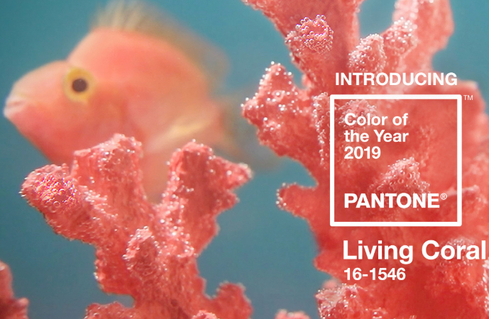
At Window Products here in Southbury, we know that many of our customers can feel intimidated when trying to choose color—we hear that they often fear being “wrong or making some kind of mistake. Because there are so many choices out there, we like to introduce people to color whenever we can. And, because the Pantone Color Institute chooses a new trending Color of the Year each year, we like to take the opportunity to let our customers learn about a color they might not have considered, just to see if it will have the right feel for them. Read on to learn about this year’s color!
Living Coral
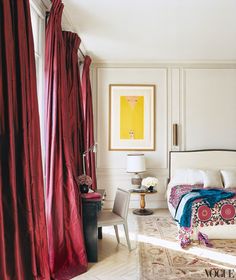
For 2019, the Color of the Year is PANTONE 16-1546, Living Coral, which has a golden undertone that energizes and enlivens with a softer edge. Effervescent, yet mellow, Living Coral grips us with warmth and peacefulness to provide relief in a continually shifting environment. This soothing color encourages lighthearted activity, our need for optimism, and our desire for playful expression. In your home, consider using Living Coral on your walls, window coverings, custom bedding, accent pieces, or even kitchen gadgets and appliances to create a tranquil retreat and more. You can also add complementary colors to offset the specific coral hue and to create a complete ambiance. For example, you could get decorative throw pillows in aqua and throws in seafoam. Or add artwork, vases, or table lamps in one of the colors to bring out a pop.
Who Picks the Forecasted Colors of the Year and Why?
Twice a year, the Color Marketing Group (the color/trend forecasters and home décor and fashion designers) meet to decide what the colors will be for the next two years. Before they meet, they must study past trends and forecast future ones. Several factors can influence the choice, including:
- Economy—When the economy is strong, popular color gets rich, deep, and vibrant. When it is weak, we see trends toward light colors and soft/safe colors.
- War—When the country is under attack, color leaves our homes and becomes safe, soft, and practically nonexistent. Taupe, grays, and whites are war colors.
- Events—When major events are forecasted, such as the Presidential election, the Olympics, and, yes, even a popular movie, softer and safe colors are what we are drawn to.
Color is not a designer’s whim. Color trends come from where we are, where we want to go, and how people are feeling or not feeling. And this year, we feel coral—look around next time you’re in a store. You’ll be sure to see plenty of coral all around.
Using the Color of the Year in Guilford, Madison, Clinton CT Areas
At Window Products, we’ve been serving Connecticut since 1994 with two showrooms – one in Branford and one in Southbury. We offer the full line of Hunter Douglas window fashions, a nice selection of screen shades, and a wide variety of awnings and shades. Our personalized service, quality products, and professional installation services ensure you’ll find the perfect window treatment or awning for your home or business. Contact us for more details.
